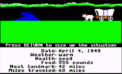
 I love this concept, imagine taking websites and looking at them on the technology available at the time. This takes away the trappings of higher deff, or resolution. yes the monitors were smaller, no the refresh rate wasn’t what it should be. But the web as an experiential place, was experienced through these eyes.
You sitting at your desk in 1994 logging onto AOL clicking through 15 screens to get to the Internet. Explaining to people who have AOL that they don’t NEED AOL to get to the internet. Prodigy, Compuserv, Imagination, GeoCities, BBS all these gateways were portals to the world.
These were the decks that people used to log into the system to pull a term from William Gibson. By today’s standards they were horrible. But with technology ever advancing how do you relive what was once the way things were done?
An installation at Internet week in New York called Digital Archaeology does this. It was designed by Jim Boulton and partners and originally debuted in London in 2010. The centerpiece is called The Project 1991, It pulls archaic cruft out of geeks basements and serves them the page designs and cookies of their time. This is a neat idea. One day I hope something like this makes its way to Philadelphia!. How would you like to see it in your neck of the woods?
Digital Archeology, An Exhibition of the Evolution of the Website.
